
February 13, 2023
. 12 min readBuild React Form With This Best Practice
Learn how to create and handle forms in React with the best practice in mind. This tutorial covers everything from fundamental concepts to advanced techniques.

Many web applications built with React have sections that display form input to take the user’s data.
This lesson will discuss how to best handle form inputs in React. We will build a side project to explain the different input types, including checkbox, text, select input, radio, range, and text area.
This React tutorial is part 4 of 17 in the React for beginners series.
- Part 1 – React Tutorial: A Comprehensive Guide for Beginners
- Part 2 – React Components and Data Model
- Part 3 – React Hooks: Managing State and Side-Effects
- Part 5 – Raising and Handling Events in React
- Part 6 – React Developer Tools: Debug and optimize React apps
- Part 7 – CSS in React: Styling React Components
- Part 8 – React Todos App: Add Editing functionality
- Part 9 – Profiling: Optimizing Performance in React
- Part 10 – Using LocalStorage with React
- Part 11 – How to Use React Icons
- Part 12 – React Context API: Managing Application State
- Part 13 – Zustand Tutorial: Managing React State
- Part 14 – React Router: The Beginners Guide
- Part 15 – React children props: What Is It?
- Part 16 – React Toggle Button: Let’s Switch Navigation Widget
- Part 17 – Deploy React App With Vercel
While there are React form libraries like Formik and React Hook Form that hastens form integration in a project, knowing the logic behind forms is beneficial and will even make using a third-party library easier.
The Gif below demonstrates the form project we will build together in this lesson. You can interact with it here, and after that, get started!
React Form vs. HTML Form
Form elements in React JSX are handled differently compared to that in HTML. In HTML, form inputs keep their internal state and are maintained by the browser DOM. This DOM is the “source of truth,” and any data passed to the form input will be available inside it (i.e., the DOM).
React however propose a different approach to working with form elements. Form inputs in React can either be controlled or uncontrolled input.
Uncontrolled React Form Input
This type of input behavior is similar to that of the HTML inputs, as the DOM handles the input data.
Consider the following rendered form elements:
const Form = () => {
  return (
    <>
      <h1>React Form Handling</h1>
      <form>
        <label>
          First Name: <input type="text" />
        </label>
      </form>
    </>
  );
};
export default Form;
If we temporarily add a value prop and assign an empty string, for instance, the form input immediately becomes read-only and seize to be altered:
<input type="text" value="" />
This is because the value attribute overrides the value in the DOM. In an uncontrolled implementation, we don’t specify a value attribute for the DOM to handle the element data. If we must specify an initial value, we can use the defaultValue attribute instead.
Getting Data From the React Input
To get form data from an uncontrolled input field, React lets us use a ref to access the input DOM element and pull value from the DOM.
Consider the following code:
import { useRef } from "react";

const UncontrolledForm = () => {
  const ref = useRef();
  const handleSubmit = (e) => {
    e.preventDefault();
    alert(ref.current.value);
  };
  return (
    <>
      <h1>Uncontrolled Form</h1>
      <form onSubmit={handleSubmit}>
        <label>
          First Name: <input type="text" ref={ref} />
        </label>
        <input type="submit" />
      </form>
    </>
  );
};
export default UncontrolledForm;
We started by passing the reference object to the input field to access the field value. Then, we controlled the submit action by adding an event handler on the <form>’s onSubmit attribute.
The form submission will trigger the handleSubmit handler and display the input value. See the demo and the complete code on CodeSandbox.
Later in the series, we'll use uncontrolled implementation to manage unnecessary component re-rendering efficiently.
Controlled React Form Input
With a controlled input, we handle the input data in a React component, not the browser DOM. In a React project, we often use a controlled implementation over its counterpart.
Notes on the React controlled input:
- A component state is needed to serve as the source of truth instead of DOM.
- Input elements listen to the component state by taking a checked attribute for checkboxes or a value attribute for other input elements.
- An event handler is needed to get the input value for every state update.
Let’s see how all of these connect!
React Text Input Field
In a Form component, we will create a state to manage the user’s input. We will then pass the current state as value to the input’s value attribute:
import { useState } from "react"
const Form = () => {
const [fname, setFname] = useState("")
return (
<>
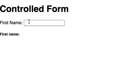
<h1>Controlled Form</h1>
<form>
<label>
First Name: <input type="text" value={fname} />
</label>
</form>
<h5>First name: {fname}</h5>
</>
);
};
export default Form;
By adding the state value to the input's value attribute, the element now listens only to the state. Since the initial state value is an empty string, the input field will also be blank on the initial DOM render. With this, we have made the field a controlled input.
We cannot change the input content, so we need an onChange event handler that listens to a change in the input field. This handler will call the setFname state updater function with the current input value:
import { useState } from "react"
const Form = () => {
  const [fname, setFname] = useState("");

  const handleChange = (e) => {
    setFname(e.target.value);
  };

  return (
    <>
      <h1>Controlled Form</h1>
      <form>
        <label>
          First Name:{" "}
          <input type="text" value={fname} onChange={handleChange} />
        </label>
{/* ... */}
For every change in the input field, the onChange is triggered and calls the handleChange handler with the latest input value. Once the state is updated, React re-renders the component and ensures the UI reflects the current state value.
With this, we can do many things including instant field validation. That is impossible with uncontrolled input, where we can only get input values from the DOM after form submission.
Multiple Text Input Fields
Let's see the best and easiest way to handle multiple form fields. We will add another text input that collects the user’s last name.
We can set up another state for the last name and assign the state value to the input’s value prop. However, this approach requires defining another handler function to update the input state.
That is okay if we have a few input fields. However, it may be tedious for many input fields. We want to manage all the input states with a single useState() Hook and a single handler function.
To do that, we will change the state value from a string to an object containing all the related state data. We will update the Form component, so we have the following:
import { useState } from "react";
const Form = () => {
  const [state, setState] = useState({
    fname: "",
    lname: ""
  });
  return (
      //
  );
};
export default Form;
The first and last names will now be available via the state.fname and state.lname respectively.
You can use any convenient state name. You mustn’t use
stateandsetState.
Next, in the JSX, let’s ensure the input’s value attribute reflect the updated state value:
return (
  <>
    <h1>Controlled Form</h1>
    <form>
      <label>
        First Name:{" "}
        <input type="text" value={state.fname} onChange={handleChange} />
      </label>
      <label>
        Last Name:{" "}
        <input type="text" value={state.lname} onChange={handleChange} />
      </label>
    </form>
    <h5>
      Name: {state.fname} {state.lname}
    </h5>
  </>
);
After that, let’s add a name attribute to each input and ensure it matches the name we specified in the state. This lets React know how to update the state for a specific input.
<form>
  <label>
    <input
      name="fname"
      // ...
    />
  </label>
  <label>
    <input
      name="lname"
      // ...
    />
  </label>
</form>
Finally, let’s update the handleChange handler, so we have the following:
const handleChange = (e) => {
  setState({
    ...state,
    [e.target.name]: e.target.value
  });
};
What is happening in the handleChange?
This handler, as mentioned earlier, is called whenever an input field updates, and it will invoke the setState updater function to update the state. The [e.target.name] used in the function lets us dynamically update the state object key corresponding to the active input. For example, if the input field of the first name changes, the fname assigned to the name prop replaces [e.target.name] like so:
setState({
  ...state,
  fname: e.target.value,
})
Earlier in the series, we mentioned that React adopts functional programming concepts. It treats mutable data structures like objects and arrays as immutable data. Meaning we must not modify the original state when it is an object. Instead, we must make a copy using the … ES6 spread operator and add the affected property.
At this point, if we test the project, it will work as expected!
Avoiding a common bug
If we ignore the functional programming concept and do not copy the object before updating:
const handleChange = (e) => {
  setState({
    // ...state,
    [e.target.name]: e.target.value
  });
};
We'll introduce a bug! If we try to fill the input fields, the input text overrides one another in the UI.
Another functional programming concept that React adopts is ensuring that the updater function, in this case, setState uses a state variable that passes as an argument of a callback function:
const handleChange = (e) => {
  setState((state) => ({
    ...state,
    [e.target.name]: e.target.value
  }));
};
Now that we know how the control field works in React, adding other form fields should be a piece of cake.
React Textarea Field
A text area is a multi-line text input field. Unlike in HTML, React JSX textarea is a self-closing element similar to the text input.
To add a textarea to our project, we’ll start by adding a state variable for the user’s input. Let’s call it a message:
const [state, setState] = useState({
  fname: "",
  lname: "",
  message: "",
});
Next, we will render a <textarea /> element with the name, value, and onChange attributes in the return statement:
return (
  <>
    <form>
      {/* ... */}
      <label>
        Your Message:
        <textarea
          name="message"
          value={state.message}
          onChange={handleChange}
        />
      </label>
    </form>
    <h5>{/* ... */}</h5>
    <p>Message: {state.message}</p>
  </>
);
Because the textarea also uses a value attribute like the text input, the handleChange handler will also work without modifying it.
Select Input Field
The <select> element defines a dropdown list using the <option> for menu options. Here, we will provide choices for the users to select a car brand from a list. We’ll start by adding a state property for the user’s dropdown selection:
const [state, setState] = useState({
  // ...
  carBrand: "",
});
In the Form component, we’ll add the following car items above the return statement:
const carBrands = ["Mercedes", "BMW", "Maserati", "Infinity", "Audi"];
Next, we’ll loop through the carBrands array and render each item in the <option> element:
const carBrandOptions = carBrands.map((carBrand, key) => (
  <option value={carBrand} key={key}>
    {carBrand}
  </option>
));
Then, we will render the carBrandOptions list in the <select> element:
return (
  <>
    <form>
      {/* ... */}
      <label>
        Car brand:
        <select
          name="carBrand"
          value={state.carBrand}
          onChange={handleChange}
        >
          <option value={""} disabled>
            --Pick a car brand--
          </option>
          {carBrandOptions}
        </select>
      </label>
    </form>
    {/* ... */}
    <h5>Favorite car brand: {state.carBrand}</h5>
  </>
);
Notice how we added <option> element with a value={""} and disabled attributes in the <select> element. This lets us default the selected value to the text contained inside the element.
React Checkbox Input Field
Unlike the other fields discussed above, the input checkbox uses a checked attribute instead of a value attribute and takes a boolean true or false value. Presently, in the handleChange handler, we only made provisions for inputs with value attributes using e.target.value. We will modify the handler to accommodate input with checked attributes.
In the Form component, let’s start by adding a new property to toggle a checkbox:
const [state, setState] = useState({
  // ...
  isChecked: false,
});
This initial value of false will make the checkbox unchecked on the initial DOM render. We will now render the input checkbox in the return statement:
return (
  <>
    <form>
      {/* ... */}
      <label>
        <input
          type="checkbox"
          name="isChecked"
          checked={state.isChecked}
          onChange={handleChange}
        />
        Is Checked?
      </label>
    </form>
    {/* ... */}
    <h5>Is it checked? : {state.isChecked ? "Yes" : "No"}</h5>
  </>
);
Next, we’ll update the handleChange to accommodate the checkbox inputs.
const handleChange = (e) => {
  const value = e.target.type === "checkbox" ? e.target.checked : e.target.value;
  setState((state) => ({
    ...state,
    [e.target.name]: value
  }));
};
In the code, we used a ternary operator (inline if-statement) to check if the target input element is a checkbox or other types, then we update the state accordingly.
React Radio Inputs
Radio buttons are presented in radio groups to allow users to select one button at a time. We will add a gender to our Form component to let users select a gender. To implement this input type, we will combine the logic of the input text and that of the checkbox by using the value and checked attributes.
Let’s start by adding a state for users' gender:
const [state, setState] = useState({
  // ...
  gender: "",
})
Then, in the return statement, we will add radio inputs with name, value, checked, and onChange attributes for both genders:
return (
  <>
    <form>
      {/* ... */}
      <label>
        <input
          type="radio"
          name="gender"
          value="male"
          checked={state.gender === "male"}
          onChange={handleChange}
        />{" "}
        Male
      </label>
      <label>
        <input
          type="radio"
          name="gender"
          value="female"
          checked={state.gender === "female"}
          onChange={handleChange}
        />{" "}
        Female
      </label>
    </form>
    {/* ...  */}
    <h5>Gender : {state.gender}</h5>
  </>
);
For this input type to allow a selection at a time, the name attribute must be the same and equal to the key we specified in the state. The value attribute is assigned a static value that uniquely identifies which radio button is selected. The checked attribute lets us select a button if the condition assigned returns true.
React Range Input Element
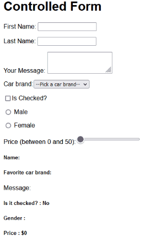
We use this input type to filter a list of items based on numeric values. In our project, we will set up a control that displays dynamic prices between 0 and $50.
As expected, we’ll update the state to include a price property like so;
const [state, setState] = useState({
  // ...
  price: 0
});
Then, in the return statement, we will add a range input with a name, value, and onChange attributes.
return (
  <>
    <form>
      {/* ... */}
      <label>
        Price (between 0 and 50):
        <input
          type="range"
          name="price"
          min="0"
          max="50"
          value={state.price}
          onChange={handleChange}
        />
      </label>
    </form>
    {/* ... */}
    <h5>Price : ${state.price}</h5>
  </>
);
The
minandmaxattributes let us set restrictions in the control
Submit React Form
Similar to how we handled submission with uncontrolled form inputs, we’ll control the submit action by adding an event handler on the <form>’s onSubmit attribute.
const Form = () => {
  const [state, setState] = useState({
    // ...
  });
  // ...
  const handleSubmit = (e) => {
    e.preventDefault();
    console.log(state);
  };
  return (
    <>
      <h1>Controlled Form</h1>
      <form onSubmit={handleSubmit}>
        {/* ... */}
        <button>Submit</button>
      </form>
      {/* ... */}
    </>
  );
};
export default Form;
See the complete source code for the form on CodeSandbox. You can interact with the form and see the Console tab for the submission.
And that is it for this lesson!
In the next lesson, we will utilize what we learned on this page and integrate form inputs into our todos primary project.
Next part: Raising and Handling Events in React
continue