
February 13, 2023
. 7 min readCSS in React: Styling React Components
This CSS in React tutorial covers how to style a React application like a pro. Read now and take your React skills to the next level!

We have a working React application that we have developed to a good spot. We can now add CSS to provide the look and feel it deserves.
There are different ways available to add CSS in React. Some are itemized below:
- CSS-in-JS libraries like the styled-components, Emotion, JSS, Linaria
- Sass and Scss
- Utility-first, like Tailwind CSS.
This lesson will discuss using inline CSS, external stylesheet and CSS Modules in React. Let’s get started!
This React tutorial is part 7 of 17 in the React for beginners series.
- Part 1 – React Tutorial: A Comprehensive Guide for Beginners
- Part 2 – React Components and Data Model
- Part 3 – React Hooks: Managing State and Side-Effects
- Part 4 – Build React Form With This Best Practice
- Part 5 – Raising and Handling Events in React
- Part 6 – React Developer Tools: Debug and optimize React apps
- Part 8 – React Todos App: Add Editing functionality
- Part 9 – Profiling: Optimizing Performance in React
- Part 10 – Using LocalStorage with React
- Part 11 – How to Use React Icons
- Part 12 – React Context API: Managing Application State
- Part 13 – Zustand Tutorial: Managing React State
- Part 14 – React Router: The Beginners Guide
- Part 15 – React children props: What Is It?
- Part 16 – React Toggle Button: Let’s Switch Navigation Widget
- Part 17 – Deploy React App With Vercel
External CSS in React
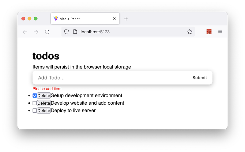
We’ll start with the most straightforward approach to adding styles. To style our todos project, let’s create a file called styles/app.css in the src folder and add the following base rules:
* {
  box-sizing: border-box;
  margin: 0;
  padding: 0;
}
body {
  font-family: "Segoe UI", sans-serif;
  line-height: 1.4;
  color: #000;
  background: #fff;
  height: 100vh;
  font-weight: 400;
}
Let’s save the file and import it inside the src/main.jsx entry file:
import '@/styles/app.css';
// import './styles/app.css';
We can use either of the above syntaxes. Remember, we resolved the file path using
@alias in our Vite project. We can also import the style in thecomponents/TodoApp.jsxparent component file instead of the entry file.
If we save the file, we should see the styles applied in the frontend.
The className Attribute
If we recall, we can apply class names to elements using a class attribute in HTML. In React JSX, we use a className syntax. Let’s update the components/TodoApp.jsx to include class names:
const TodoApp = () => {
  return (
    <div className="wrapper">
      <div className="todos">
        <Header />
        <TodosLogic />
      </div>
    </div>
  );
};
export default TodoApp;
Next, we’ll open the components/InputTodo.jsx file and update the JSX to include class names:
return (
  <>
    <form onSubmit={handleSubmit} className="form-container">
      <input
        // ...
        className="input-text"
      />
      <button className="input-submit">Submit</button>
    </form>
    <span className="submit-warning">{message}</span>
  </>
);
We’ll now update the src/styles/app.css file to include CSS rules for the class selectors:
.wrapper {
  width: 100%;
  padding: 8rem 20px 3rem;
}
.todos {
  max-width: 580px;
  margin: 0 auto;
}
.form-container {
  display: flex;
  border-radius: calc(0.1 * 100px);
  box-shadow: 0px 4px 14px 0px rgba(70, 70, 70, 0.38);
  justify-content: space-around;
  background: #fff;
  font-size: 1rem;
}
.input-text {
  width: 85%;
  padding-right: 5px;
  padding-left: 10px;
  border-radius: calc(0.5 * 100px);
  font-size: 1rem;
}
.input-text::placeholder {
  color: #000;
}
.input-submit {
  background: transparent;
  color: #5b5b5b;
  text-transform: capitalize;
  cursor: pointer;
  font-weight: 600;
  margin-right: 10px;
}
.input-text,
.input-submit {
  height: 45px;
  outline: none;
  border: none;
}
.submit-warning {
  font-size: 13px;
  color: red;
  margin-top: 5px;
  display: block;
}
If we save all files and see the frontend, our application should look like this:
Inline CSS in React
Again, in HTML, we apply inline style on elements by adding style attribute with a string of properties like so:
<h1 style="text-align:center;color:blue;">todos</h1>
In React JSX, the style attribute takes a JavaScript object with camelCased properties syntax. Suppose we apply an inline style in the components/Header.jsx file, we’ll have the following:
const Header = () => {
  return (
    <header
      style={{
        padding: '20px 0',
        lineHeight: '1.5em',
        color: '#aeadad',
        textAlign: 'center',
      }}
    >
      {/* ... */}
    </header>
  );
};
export default Header;
Writing an inline CSS in React JSX requires two curly braces; the inner curly brace for the object representing the actual styles and the outer curly brace to write a valid JavaScript expression in JSX.
Initializing a style object
We can extract the style object and assign it to a variable like so:
const Header = () => {
  const headerStyle = {
    padding: '20px 0',
    lineHeight: '1.5em',
    color: '#aeadad',
    textAlign: 'center',
  };
  return (
    <header style={headerStyle}>
      {/* ... */}
    </header>
  );
};
export default Header;
Using an inline style approach is not appropriate or advisable for specificity reasons. We should only use it if we want to add styles dynamically to elements or don’t want to override an element's style. Later on this page, we will use the style attribute to style the todos entry when we dynamically toggle the checkboxes.
CSS Modules in React
Using CSS modules is popular when building a component-based application like React apps. It lets us write separate CSS for each component and ensure styles are scoped locally to a specific component. This approach helps eliminate the risk of name conflicts associated with global scope styling.
If we scope styles to a component, we can reuse the class names in different files without worrying about conflicts with selectors.
We’ll use the CSS modules approach to style the Header and TodoItem components. To do that, we will create module files for the components using the [filename].module.css naming convention.
In the src/styles folder, let’s create Header.module.css and TodoItem.module.css files. Add the following styles rules in the Header.module.css:
.header h1 {
  font-size: 3rem;
  font-weight: 600;
  margin-bottom: 1rem;
  line-height: 1em;
  text-transform: lowercase;
  text-align: center;
}
And add the following rules in the TodoItem.module.css:
.item {
  font-size: 1rem;
  list-style-type: none;
  padding: 14px 25px;
  border-bottom: 1px solid #fff;
  background: #f0efef;
}
.content {
  display: flex;
  justify-content: space-between;
  align-items: center;
  gap: 1rem;
}
.content span {
  flex: 1;
  order: 1;
}
.content button {
  cursor: pointer;
  background: transparent;
  order: 2;
  outline: none;
  outline: none;
  border: none;
  margin-left: 7px;
}
All the style rules we defined in the module files will return as part of an object, and we can reference each selector using styles.selector. The styles is the name we’ll give to the returned object. You can name the object whatever you want.
Next, let’s import the module files into their respective components.
In the components/Header.jsx file, import the CSS Module at the top like so:
import styles from "@/styles/Header.module.css";
Then, update the JSX in the return statement to reference the .header selector:
import styles from "@/styles/Header.module.css";
const Header = () => {
  // ...
  return (
    <header style={headerStyle} className={styles.header}>
      {/* ... */}
    </header>
  );
};
export default Header;
Likewise, in the components/TodoItem.jsx file, let’s import the CSS Module and update the JSX to include the class names:
import styles from '@/styles/TodoItem.module.css';
const TodoItem = ({ itemProp, handleChange, delTodo }) => {
  return (
    <li className={styles.item}>
      <div className={styles.content}>
        <input
          type="checkbox"
          // ...
        />
        {/* ... */}
      </div>
    </li>
  );
};
export default TodoItem;
Be aware that we’ve added a
divelement to wrap thelicontent.
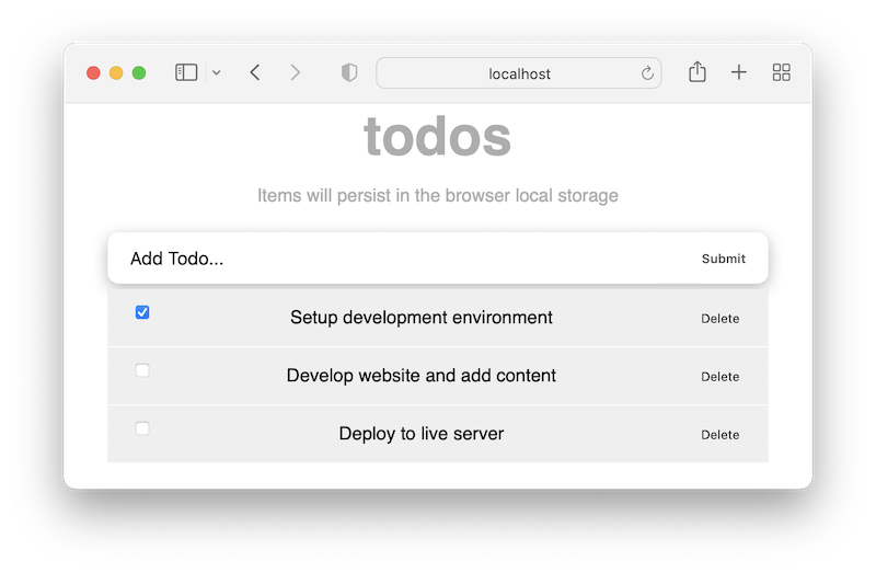
If we save all files, our application should now look like so:
Note: If we have a CSS selector separated by a hyphen (e.g
.new-class), we will use the bracket notation syntax to access the selector in the component files like so:className={styles["new-class"]}. If we do not like that syntax, we can use a camelCase syntax like so:className={styles.newClass}.
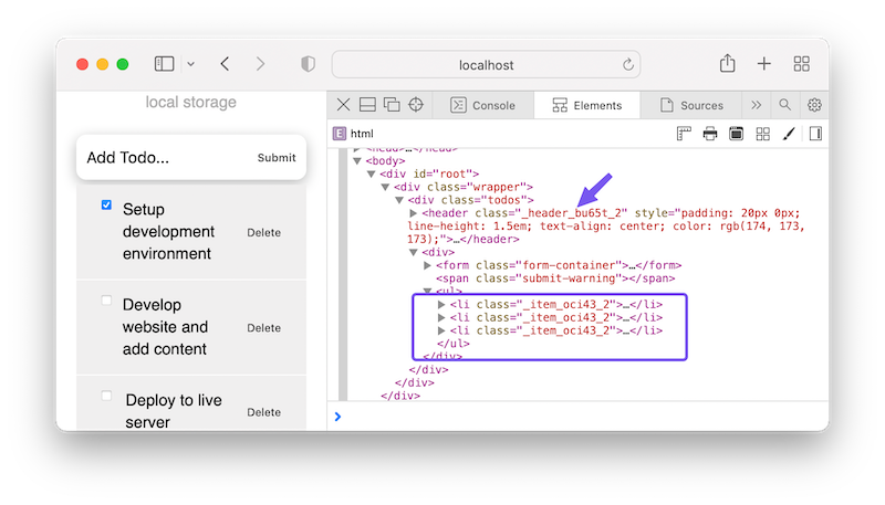
If we now inspect the application in the browser’s DevTools, we’ll see that CSS Modules help prevent name conflicts by generating unique class names:
Using Sass in React
If we want to employ a CSS preprocessor like Sass in React and use features like nesting, variables mixins and more, we can install a Sass package using npm:
npm install sass
After that, we will rename the .css file extension to .scss and update the components file to import the updated module.
Dynamic Styling With Style Attribute
When we complete a task, we want to style the entry dynamically. In the components/TodoItem.jsx file, we will update the JSX to add an inline CSS with the style attribute:
const TodoItem = ({ itemProp, handleChange, delTodo }) => {
  const completedStyle = {
    fontStyle: 'italic',
    color: '#595959',
    opacity: 0.4,
    textDecoration: 'line-through',
  };
  return (
    <li className={styles.item}>
      <div className={styles.content}>
        {/* ... */}
        <span style={itemProp.completed ? completedStyle : null}>
          {itemProp.title}
        </span>
      </div>
    </li>
  );
};
export default TodoItem;
In the code, we introduced a span tag to wrap the title and used the JavaScript ternary operator to check if a task is complete to apply a custom style. If we save the file and toggle the checkboxes, we should have the style applied.
Moving to the next lesson, we will add an edit feature to our todos project.
Next part: React Todos App: Add Editing functionality
continue