
February 13, 2023
. 6 min readReact Todos App: Add Editing functionality
Whether we are building a todos application or any React project that requires editing data, this lesson will show you how to add an edit feature to modify data entries.

Whether we are building a todos application or any React project that requires editing data, this lesson will show you how to add an edit feature to modify data entries.
This React tutorial is part 8 of 17 in the React for beginners series.
- Part 1 – React Tutorial: A Comprehensive Guide for Beginners
- Part 2 – React Components and Data Model
- Part 3 – React Hooks: Managing State and Side-Effects
- Part 4 – Build React Form With This Best Practice
- Part 5 – Raising and Handling Events in React
- Part 6 – React Developer Tools: Debug and optimize React apps
- Part 7 – CSS in React: Styling React Components
- Part 9 – Profiling: Optimizing Performance in React
- Part 10 – Using LocalStorage with React
- Part 11 – How to Use React Icons
- Part 12 – React Context API: Managing Application State
- Part 13 – Zustand Tutorial: Managing React State
- Part 14 – React Router: The Beginners Guide
- Part 15 – React children props: What Is It?
- Part 16 – React Toggle Button: Let’s Switch Navigation Widget
- Part 17 – Deploy React App With Vercel
In our todos project, we've stored the rendered items in a component state. So, let's see how to modify the state data.
Adding an Edit Button
As expected, we’ll add an edit button to individual todos entries. Let’s open the components/TodoItem.jsx file and add this button:
const TodoItem = ({ itemProp, handleChange, delTodo }) => {
  // ...
  return (
    <li className={styles.item}>
      <div className={styles.content}>
        {/* ... */}
        <button>Edit</button>
        <button onClick={() => delTodo(itemProp.id)}>Delete</button>
        {/* ... */}
      </div>
    </li>
  );
};
export default TodoItem;
Setting up a State
We will set up a state that lets us switch between view and edit modes. When in edit mode, we’ll display an editable text input containing the text to edit. However, in view mode, we will hide the editable input.
Let’s add a state that lets us display an edit input when we click an edit button:
import { useState } from 'react';
// ...
const TodoItem = ({ itemProp, handleChange, delTodo }) => {
  const [editing, setEditing] = useState(false);
  // ...
  const handleEditing = () => {
    setEditing(true);
  };
  return (
    <li className={styles.item}>
      <div className={styles.content}>
        {/* ... */}
        <button onClick={handleEditing}>Edit</button>
        {/* ... */}
      </div>
    </li>
  );
};
export default TodoItem;
Display Editable Text Input
We’ll dynamically display a text input with the text to edit. Let’s add an input field right before the closing </li> tag:
return (
  <li className={styles.item}>
    <div className={styles.content}>
      {/* ... */}
    </div>
    <input
      type="text"
      value={itemProp.title}
      className={styles.textInput}
    />
  </li>
);
Note that we’ve included a CSS Module class name. We’ll add the style rules in the TodoItem.module.css file:
.textInput {
  width: 100%;
  padding: 10px;
  border: 1px solid #dfdfdf;
  outline: none;
}
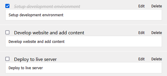
If we save the files, the layout should look like this:
Display the Edit Input Field Only When the editing State Is True
We want to display the edit input only when the item is in editing mode. We’ll update the TodoItem component to include an if/else statement that checks if an item is in edit mode or view mode, then we dynamically hide/display the item using the style attribute.
const TodoItem = ({ itemProp, handleChange, delTodo }) => {
  const [editing, setEditing] = useState(false);
  // ...
  let viewMode = {};
  let editMode = {};
  if (editing) {
    viewMode.display = 'none';
  } else {
    editMode.display = 'none';
  }
  return (
    <li className={styles.item}>
      <div className={styles.content} style={viewMode}>
        {/* ... */}
      </div>
      <input
        // ...
        style={editMode}
      />
    </li>
  );
};
export default TodoItem;
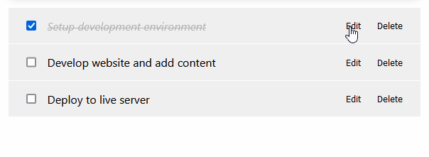
If we save the file, we should have this behavior:
Editing and Updating the Todos State
To edit the text in the text field and update the actual todos state in the parent component, we’ll listen to a change event on the input and send the updated input value up to the TodosLogic parent component to update the state.
In the TodoItem component, let’s add an onChange event to the text input:
return (
  <li className={styles.item}>
    {/* ... */}
    <input
      // ...
      onChange={(e) => console.log(e.target.value, itemProp.id)}
    />
  </li>
);
In the meantime, we are logging the updated value and item id to the console. We will send these values to the parent state.
Like we’ve been doing in the series, we’ll pass the values to the parent state through props. We’ll set up the logic in the TodosLogic component where the state lives.
const TodosLogic = () => {
  const [todos, setTodos] = useState([
    // ...
  ]);
  // other handlers ...
  const setUpdate = (updatedTitle, id) => {
    // update state
  };
  return (
    <div>
      {/* ... */}
      <TodosList
        // ...
        setUpdate={setUpdate}
      />
    </div>
  );
};
export default TodosLogic;
We defined a setUpdate handler that expects an edited item and its id and then passed the handler down to TodosList using a setUpdate prop.
Let’s access the prop in the TodosList component and further pass it down to the TodoItem:
const TodosList = ({ todosProps, handleChange, delTodo, setUpdate }) => {
  return (
    <ul>
      {todosProps.map((todo) => (
        <TodoItem
          // ...
          setUpdate={setUpdate}
        />
      ))}
    </ul>
  );
};
export default TodosList;
We’ll now grab the setUpdate in the TodoItem component and pass the updated value and item id as arguments like so:
const TodoItem = ({ itemProp, handleChange, delTodo, setUpdate }) => {
  // ...
  return (
    <li className={styles.item}>
      {/* ... */}
      <input
        //  ...
        onChange={(e) => setUpdate(e.target.value, itemProp.id)}
      />
    </li>
  );
};
export default TodoItem;
With the onChange event, a change in the edit input field will invoke the setUpdate handler that lives in the TodosLogic parent component.
Updating the UI With the Edited Text
We’ll update the setUpdate handler in the TodosLogic, so we have the following:
const setUpdate = (updatedTitle, id) => {
  setTodos(
    todos.map((todo) => {
      if (todo.id === id) {
        todo.title = updatedTitle;
      }
      return todo;
    })
  );
};
All we are doing with the code is updating the todo's title, whose id matches that of the edited input. If we save and test our project, we should be able to edit and update the state.
Exiting the Editing Mode
We’ll detect if the user presses an enter key and opt-out of the edit mode. We’ll listen for a key-down event on the edit text field and check for the Enter key using the event.key. Then, we’ll reset the editing state to false.
We’ll update the TodoItem component to include the onKeyDown event:
const TodoItem = ({ itemProp, handleChange, delTodo, setUpdate }) => {
  const [editing, setEditing] = useState(false);
  // ...
  const handleUpdatedDone = (event) => {
    if (event.key === 'Enter') {
      setEditing(false);
    }
  };
  return (
    <li className={styles.item}>
      {/* ... */}
      <input
        type="text"
        // ...
        onKeyDown={handleUpdatedDone}
      />
    </li>
  );
};
export default TodoItem;
If we save and test the project, it should work! However, the way we implemented the edited functionality can cause a performance bottleneck. This was intentional!
In the next section, we will see this issue and look at fixing it.
Next part: Profiling: Optimizing Performance in React
continue