
February 20, 2023
. 19 min readHow to create a multilevel dropdown menu in React
Multilevel dropdown menus are a staple of web design. With the ability to provide multiple options to select from, they make navigation bars dynamic and organized.

This post was originally witten for LogRocket
Multilevel dropdown menus are a staple of web design. With the ability to provide multiple options to select from, they make navigation bars dynamic and organized.
For any developer working in React or any React-based project like Gatsby or Next.js, this tutorial covers the step-by-step process of how to implement the dropdown feature in a React project. At the end of this guide, we will have the menu below:
To follow this tutorial, ensure you have a basic understanding of React and confirm you have Node.js installed on your computer. Then, we can get started.
Multilevel menu vs. mega menu
Multilevel menus are designed to reveal the deeply nested navigations when we click or hover over the submenu items, as shown in the GIF above. This design is ideal for a small to medium business site or blog.
Mega menus, on the other hand, can reveal the entire website’s navigation at once without clicking on submenus. That is, a single expansion can reveal a deeply nested website menu. This design can be useful for large websites with many categories and subcategories — for instance, a retail site.
Multilevel dropdown menu project setup in React
Let’s create a new React project with the create-react-app CLI:
npx create-react-app react-multilevel-dropdown-menu
Then do the following:
cd react-multilevel-dropdown-menu
npm start
The React project structure
Let’s visualize our project and break down the user interface into small pieces of components:
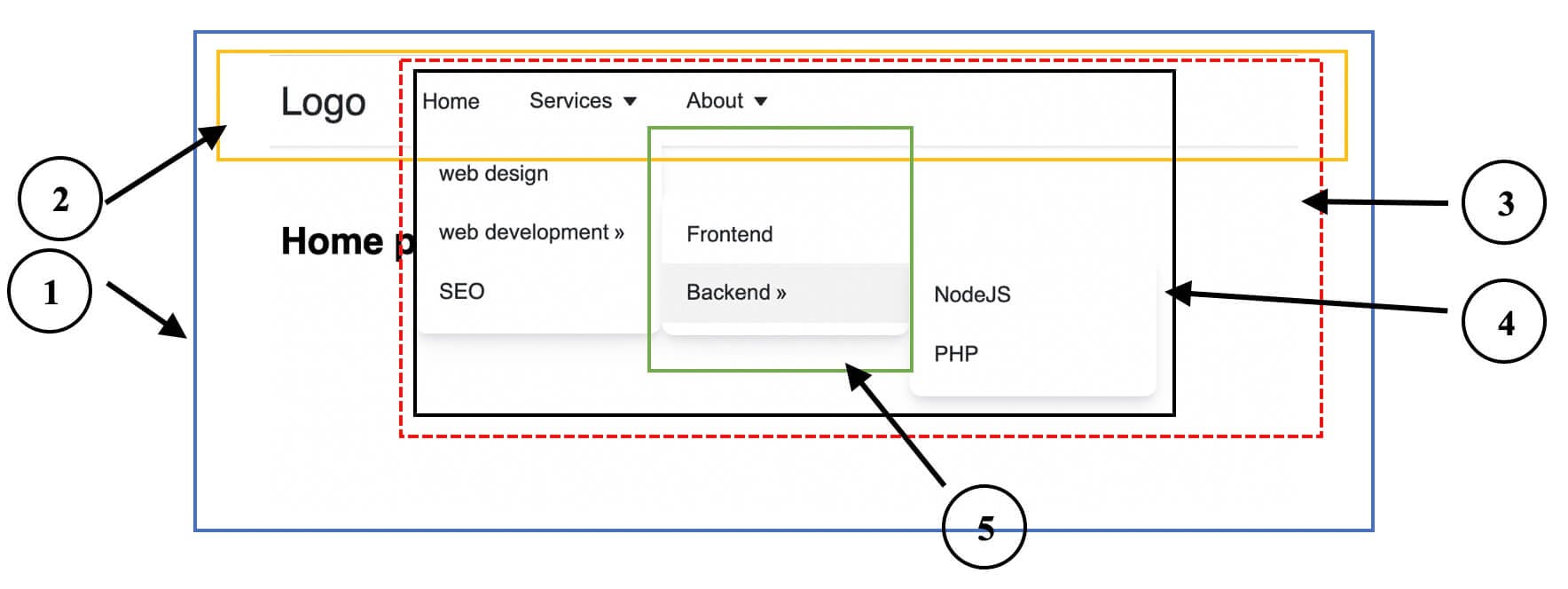
The numbered labels on the image above correspond to the following component names:
App: the parent/root componentHeader: renders the logo and navbar contentNavbar: renders theMenuItemscomponentMenuItems: renders individual items and the dropdownDropdown: also renders menu items
From this breakdown, we will create five different components. We will add more components later when we get started with routing.
This project, as we can see, renders the menu navigation in the top section of the page. Nonetheless, the same process will be applied to rendering the navigation in the sidebar.
Creating the project files
In the src folder, let’s ensure the file tree follows this structure:
 ...
  ├── src
  │    ├── components
  │    │     ├── App.js
  │    │     ├── Dropdown.js
  │    │     ├── Header.js
  │    │     ├── MenuItems.js
  │    │     └── Navbar.js
  │    ├── App.css
  │    └── index.js
In the components/App.js file, let’s render some simple text:
const App = () => {
  return <div>App content</div>;
};

export default App;
Save the file. Now replace the content of the src/index.js file with the following:
import React from 'react';
import ReactDOM from 'react-dom/client';
import App from './components/App';

// styles
import './App.css';

const root = ReactDOM.createRoot(document.getElementById('root'));
root.render(
  <React.StrictMode>
    <App />
  </React.StrictMode>
);
We’ve imported a CSS file to add the “look and feel” we want to our project. So, let’s copy the styles from the multilevel-dropdown-menu project to replace the styles in the src/App.css file.
Save all the files and see the content of the App component rendered in the browser.
Rendering top-level menu items
Let’s start building by rendering the top-level menu items. To do this, let’s create a src/menuItems.js file to hold the menu items:
export const menuItems = [
  {
    title: 'Home',
    url: '/',
  },
  {
    title: 'Services',
    url: '/services',
  },
  {
    title: 'About',
    url: '/about',
  },
];
Now, save the file.
If we recall from our project image in the beginning, the components/App.js file will render the Header component that holds the logo and the Navbar component. So, in the components/Header.js file, let’s add the following code:
import Navbar from './Navbar';

const Header = () => {
  return (
    <header>
      <div className="nav-area">
        <a href="/" className="logo">
          Logo
        </a>
        <Navbar />
      </div>
    </header>
  );
};

export default Header;
For now, we are using the <a> tag for the internal link. Later in this guide, we will replace it with the Link or NavLink component from the react-router-dom.
Notice that we imported the Navbar component. So, head over to the components/Navbar.js and add the following code:
const Navbar = () => {
  return (
    <nav>
      <ul className="menus">Nav Items here</ul>
    </nav>
  );
};

export default Navbar;
Next, let’s ensure we update the components/App.js file to render the Header component:
import Header from './Header';

const App = () => {
  return (
    <div>
      <Header />
    </div>
  );
};

export default App;
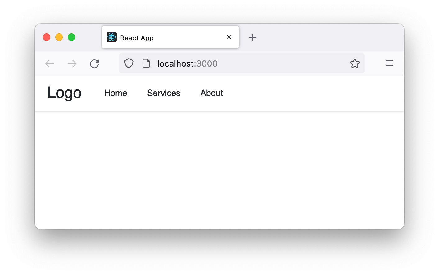
If we save all files, we should see a logo and the navigation text displayed on the frontend.
Next, in the components/Navbar.js file, import the menuItems data, loop through it, and then render them in the JSX:
import { menuItems } from '../menuItems';
const Navbar = () => {
  return (
    <nav>
      <ul className="menus">
        {menuItems.map((menu, index) => {
          return (
            <li className="menu-items" key={index}>
              <a href={menu.url}>{menu.title}</a>
            </li>
          );
        })}
      </ul>
    </nav>
  );
};

export default Navbar;
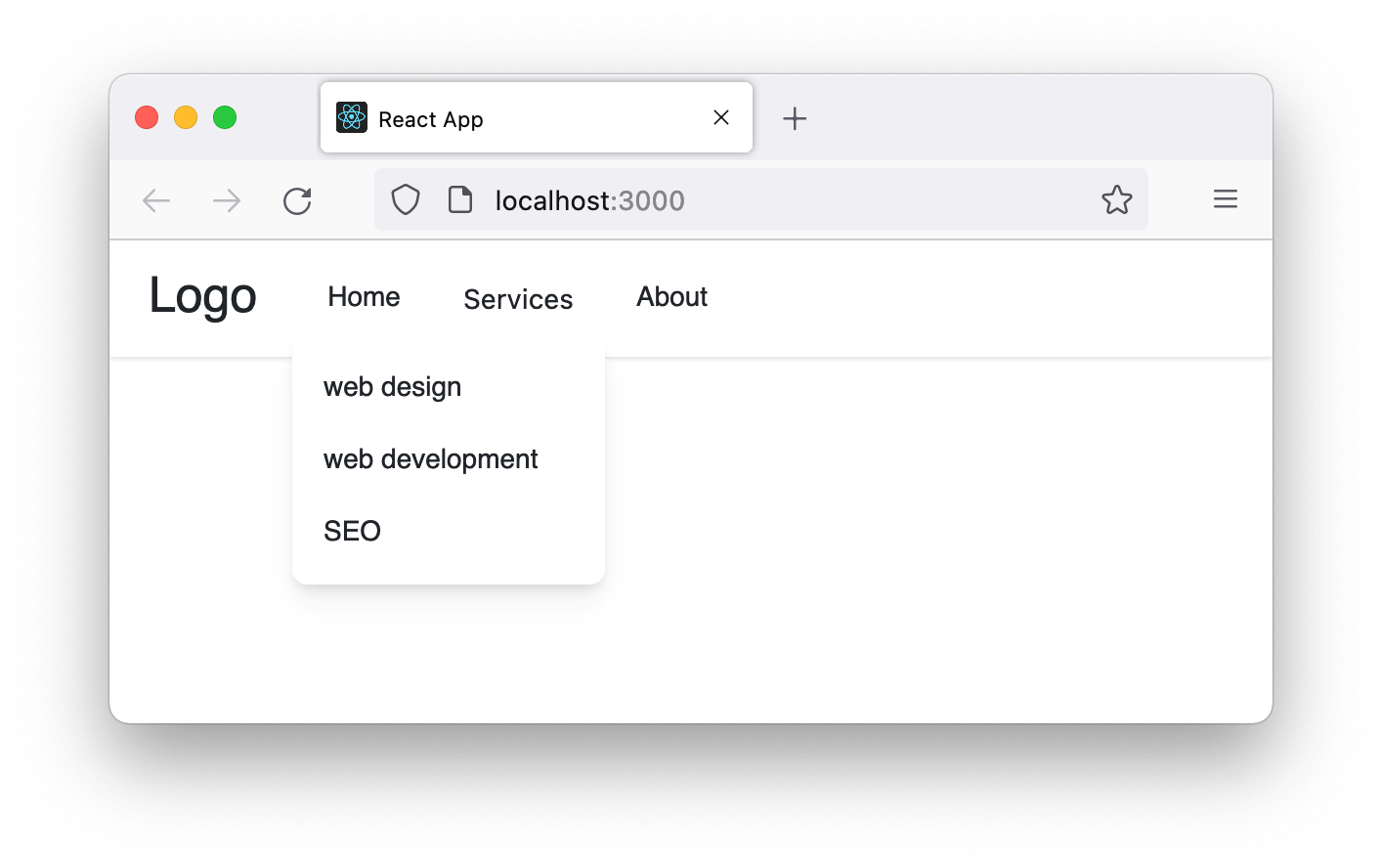
Save the file and check the frontend. It should look like so:
This is a basic navigation menu. Let’s go a step further and display a single-level dropdown next.
Rendering a single-level dropdown menu
Let’s head over to the src/menuItems.js file and update the data to include a submenu like so:
export const menuItems = [
  // ...
  {
    title: 'Services',
    url: '/services',
    submenu: [
      {
        title: 'web design',
        url: 'web-design',
      },
      {
        title: 'web development',
        url: 'web-dev',
      },
      {
        title: 'SEO',
        url: 'seo',
      },
    ],
  },
  // ...
];
Here, we added a submenu to Services because we want to make it a dropdown. Let’s save the file.
Note that you can ignore the forward slash / in the submenu URLs. In our case here, it doesn’t matter if we add it or not. However, if you want to achieve a dynamic nested route, you mustn’t include it.
At the moment, the Navbar is rendering the menu items in our code. If we take a look at the design once again, the MenuItems component, which is a direct child to the Navbar, holds the responsibility to render these items.
So, modify the Navbar so we have the following:
import { menuItems } from '../menuItems';
import MenuItems from './MenuItems';
const Navbar = () => {
  return (
    <nav>
      <ul className="menus">
        {menuItems.map((menu, index) => {
          return <MenuItems items={menu} key={index} />;
        })}
      </ul>
    </nav>
  );
};

export default Navbar;
In the code, we are passing the menu items data to the MenuItems component via the items prop. This is a process called prop drilling and is a basic React principle.
In the MenuItems component, we will receive the items prop and display the menu items. We will also check if the items have a submenu and then display a dropdown. So open the components/MenuItems.js file and add the following code:
import Dropdown from './Dropdown';

const MenuItems = ({ items }) => {
  return (
    <li className="menu-items">
      {items.submenu ? (
        <>
          <button type="button" aria-haspopup="menu">
            {items.title}{' '}
          </button>
          <Dropdown submenus={items.submenu} />
        </>
      ) : (
        <a href={items.url}>{items.title}</a>
      )}
    </li>
  );
};

export default MenuItems;
In the code, we use the button element to open the dropdown menu. If we use a link tag instead, we must add a role="button" if we want assistive technology such as screen readers.
Also in the code, we imported the Dropdown component and passed the submenu items via the prop.
Let’s now open the components/Dropdown.js file and access the prop so we can render the submenu like so:
const Dropdown = ({ submenus }) => {
  return (
    <ul className="dropdown">
      {submenus.map((submenu, index) => (
        <li key={index} className="menu-items">
          <a href={submenu.url}>{submenu.title}</a>
        </li>
      ))}
    </ul>
  );
};

export default Dropdown;
Remember to save all the files.
To see the dropdown menus, open the src/App.css file and temporarily comment out the display: none; part of the CSS:
    .dropdown {
     ...
     /* display: none; */
    }
We’ve added a display: none; property to the dropdown to hide it by default and only open it when we interact with the menu.
Once we remove the display: none; property, the menu should look like so:
Good. We are getting there!
Toggling the Dropdown menu
Let’s now define the logic that detects when a dropdown menu item is clicked so we can dynamically display or hide the dropdown box. To do this, we must add a state and update it on the dropdown menu click.
In the components/MenuItems.js file, let’s update the code to include the state:
import { useState } from "react";
// ...
const MenuItems = ({ items }) => {
  const [dropdown, setDropdown] = useState(false);
  return (
  <li className="menu-items">
    {items.submenu ? (
    <>
      <button
      // ...
      aria-expanded={dropdown ? "true" : "false"}
      onClick={() => setDropdown((prev) => !prev)}
      >
      {items.title}{" "}
      </button>
      <Dropdown
      // ...
      dropdown={dropdown}
      />
    </>
    ) : (
    // ...
    )}
  </li>
  );
};
In the code, we’ve defined a state variable called dropdown with a default value of false and a setDropdown updater to toggle the state when the dropdown button is clicked, as seen in the onClick event.
This allows us to dynamically add value to the aria-expanded attribute to indicate if a dropdown box is expanded or collapsed, which is beneficial for screen readers. We’ve also passed the dropdown variable to the Dropdown component as a prop so we can handle the dropdown toggle.
Let’s open the components/Dropdown.js to access the dropdown prop and use it to dynamically add a class name when a dropdown menu is clicked.
const Dropdown = ({ submenus, dropdown }) => {
  return (
  <ul className={`dropdown ${dropdown ? "show" : ""}`}>
    {/* ... */}
  </ul>
  );
};

export default Dropdown;
The show class name is added when a dropdown is activated. We’ve also added a display: block; style declaration in our CSS file to display the dropdown.
Now, we can return the display: none; back to the .dropdown class selector in the src/App.css:
.dropdown {
  ...
  display: none;
}
Let’s save our files. We should now be able to toggle our menu dropdown.
Multilevel dropdown menu
Like the single level dropdown, to add a multilevel dropdown, let’s open the src/menuItems.js file and update the data to include multilevel submenu components like so:
export const menuItems = [
  // ...
  {
    title: 'web development',
    url: 'web-dev',
    submenu: [
      {
        title: 'Frontend',
        url: 'frontend',
      },
      {
        title: 'Backend',
        submenu: [
          {
            title: 'NodeJS',
            url: 'node',
          },
          {
            title: 'PHP',
            url: 'php',
          },
        ],
      },
    ],
  },
  // ...
];
After adding a submenu to the “web development” option and another submenu to the “Backend” option, save the file.
Rendering a multilevel dropdown menu
We are aware that a dropdown item can also have menu items, another dropdown item, and so on. To achieve this design, we will recursively render the menu items. In the Dropdown component, let’s delegate the rendering of the menu items to the MenuItems component.
Open the components/Dropdown.js file, import the MenuItems, and pass the submenu via the items prop:
import MenuItems from "./MenuItems";
const Dropdown = ({ submenus, dropdown }) => {
  return (
  <ul className={`dropdown ${dropdown ? "show" : ""}`}>
    {submenus.map((submenu, index) => (
    <MenuItems items={submenu} key={index} />
    ))}
  </ul>
  );
};

export default Dropdown;
If we save the files and test the dropdown, it works, but we will notice that the dropdown overlaps each other.
When we click the “web development” submenu, we want to logically position its dropdown to the right. We can achieve this by detecting the dropdown depth level.
Detecting the menu depth level
Knowing the menu depth level allows us to do a couple of things. First, we can dynamically add varying arrows to show that a dropdown exists. Second, we can use it to detect a “second and above” level dropdown, hence logically positioning them to the right of the submenu.
Open the components/Navbar.js file and add the following above the return statement:
const depthLevel = 0;
Also, let’s ensure we pass the value to the MenuItems via a prop. Our code now looks like so:
// ...
  return (
  // ...
    {menuItems.map((menu, index) => {
    const depthLevel = 0;
    return <MenuItems items={menu} key={index} depthLevel={depthLevel} />;
    })}
  // ...
  );
// ...
Next, in the MenuItems component, we access the depthLevel and use it to display dropdown arrows:
const MenuItems = ({ items, depthLevel }) => {
// ...
return (
<li className="menu-items">
{items.submenu ? (
<>
<button
// ...
>
{items.title}{" "}
{depthLevel > 0 ? <span>»</span> : <span className="arrow" />}
</button>
<Dropdown
depthLevel={depthLevel}
// ...
/>
For the depthLevel greater than 0, we display a right arrow using an HTML entity name, », else we add an .arrow class name to style a custom down arrow. In our stylesheet, we added the styles for the down arrow.
Notice also that we are passing the depthLevel to the Dropdown via prop; there, we will increment it for the dropdown menus.
In the components/Dropdown.js file, access the depthLevel prop, increment it, and check if the value is greater than 1 so we can add a custom class to the dropdown. We have added styling for the class in our stylesheet.
Also, ensure that we pass the depthLevel to the MenuItems as a prop:
const Dropdown = ({ submenus, dropdown, depthLevel }) => {
  depthLevel = depthLevel + 1;
  const dropdownClass = depthLevel > 1 ? "dropdown-submenu" : "";
  return (
  <ul className={`dropdown ${dropdownClass} ${dropdown ? "show" : ""}`}>
    {submenus.map((submenu, index) => (
    <MenuItems
      // ...
      depthLevel={depthLevel}
    />
    ))}
  </ul>
  );
};

export default Dropdown;
Let’s save the files and test the project.
Now that we can toggle the menus, we need a way to close the dropdown when we click outside of it.
Closing the dropdown menu when users click outside it
By clicking outside the dropdown menu, we want to close it. We can do this by setting the dropdown state to the default value of false. We will define a logic that detects a click outside of the dropdown.
Let’s open the components/MenuItems.js file and update the import to include the useEffect and useRef Hook like so:
import { useState, useEffect, useRef } from "react";
Next, we will use the useRef to access the DOM elements of the dropdown by passing a reference object to the target node:
const MenuItems = ({ items, depthLevel }) => {
  // ...
  let ref = useRef();
  return (
  <li className="menu-items" ref={ref}>
    {/* ... */}
  </li>
  );
};

export default MenuItems;
Then, add the following code above the return statement:
useEffect(() => {
  const handler = (event) => {
  if (dropdown && ref.current && !ref.current.contains(event.target)) {
    setDropdown(false);
  }
  };
  document.addEventListener("mousedown", handler);
  document.addEventListener("touchstart", handler);
  return () => {
  // Cleanup the event listener
  document.removeEventListener("mousedown", handler);
  document.removeEventListener("touchstart", handler);
  };
}, [dropdown]);
Let’s save our files and test our project. It works!
In the useEffect Hook, we check if a dropdown is open and then check if the DOM node that is being clicked is outside of the dropdown, then we close the dropdown. You can read more about detecting outside click in React here.
Toggling dropdown on a mouse hover for bigger screens
Let’s add the functionality that displays the dropdown when the user moves the mouse over the menu item.
In the components/MenuItems.js, update the li in the JSX to include the onMouseEnter and onMouseLeave events:
const MenuItems = ({ items, depthLevel }) => {
  // ...
  return (
  <li
    // ...
    onMouseEnter={onMouseEnter}
    onMouseLeave={onMouseLeave}
  >
    {/* ... */}
  </li>
  );
};

export default MenuItems;
Then, add the following event handler function above the return statement:
const onMouseEnter = () => {
  window.innerWidth > 960 && setDropdown(true);
};

const onMouseLeave = () => {
  window.innerWidth > 960 && setDropdown(false);
};
Save the file and test your project.
With the code, the onMouseEnter handler is invoked when the mouse pointer moves onto a menu item. And from there, we check if the interior width of the window is greater than 960px, then, we open the dropdown.
Whenever the mouse leaves the menu item, we invoke the onMouseLeave handler, which then closes the dropdown.
Implementing routing
In our project, presently, we are using the HTML <a> tag to link internal pages. This causes a full page to reload whenever we click any of the menu items.
For a React application, we are expected to use optimized link tags like Link or NavLink component for this operation. Likewise, we need to ensure the navigation items points and render their respective pages, so we have the feel of a multipage application.
This is where routing comes in. We will use the React router to keep track of the current URL and display different views based on the URL.
Let’s install the library:
npm install react-router-dom@6
Connect React app to browser’s URL
In the src/index.js file, let’s wrap the top-level component, App, in a router component:
// ...
import { BrowserRouter } from 'react-router-dom';

const root = ReactDOM.createRoot(document.getElementById('root'));
root.render(
  <React.StrictMode>
    <BrowserRouter>
      <App />
    </BrowserRouter>
  </React.StrictMode>
);
Save and ensure your app still work.
Updating internal links
Both the Header and MenuItems components use the <a> tag to link internal pages. We will replace the tag with the Link component from the router library. Open the components/Header.js, import Link, and use it like so:
// ...
import { Link } from 'react-router-dom';

const Header = () => {
  return (
    <header>
      <div className="nav-area">
        <Link to="/" className="logo">
          Logo
        </Link>
        <Navbar />
      </div>
    </header>
  );
};

export default Header;
Similarly, in the components/MenuItems.js, let’s import the Link to replace the HTML <a> tag:
// ...
import { Link } from 'react-router-dom';

const MenuItems = ({ items, depthLevel }) => {
  // ...
  return (
    <li>
      {items.submenu ? (
        <>{/* ... */}</>
      ) : (
        <Link to={items.url}>{items.title}</Link>
      )}
    </li>
  );
};

export default MenuItems;
If we save the file and test our application, we should now be able to navigate without a page reload.
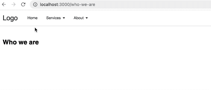
Add some routes
Now, we will add routes and render them to match their URL. Let’s create an src/routes folder to hold all the different routes. In the folder, let’s add the Home.js file to render the index page and add the following code:
const Home = () => {
  return <h2>Home page content</h2>;
};

export default Home;
You can find the list of all the project routes here. Please include them in your project and ensure you add their respective content.
Next, we will configure the route so that React router knows how to render the app at different URLs. We will do this in the components/App.js file. This file presently renders the Header component.
Let’s remove the Header component and render the routes:
import { Routes, Route } from 'react-router-dom';
import Home from '../routes/Home';
import About from '../routes/About';
// ...

const App = () => {
  return (
    <>
      <Routes>
        <Route path="/" element={<Layout />}>
          <Route index element={<Home />} />
          <Route path="about" element={<About />} />
          {/* ...*/}
        </Route>
      </Routes>
    </>
  );
};

export default App;
For brevity, we removed some of the routes. See the complete code here.
In the code, we nested all the routes as children inside a Layout route. Let’s create a components/Layout.js file and render the Header component and an Outlet that swaps between the child routes.
import { Outlet } from 'react-router-dom';
import Header from './Header';

const Layout = () => {
  return (
    <div>
      <Header />
      <div className="content">
        <Outlet />
      </div>
    </div>
  );
};

export default Layout;
If we save and test our project, we should be able to render components that match their routes.
A linkable dropdown button
Sometimes, we may want a dropdown menu button like “Services” to point to its own page /services while still showing the dropdown items when we hover over on a large screen.
To do this, we must ensure the dropdown menu in the src/menuItems.js also include its URL path:
export const menuItems = [
  // ...
  {
    title: 'Services',
    url: '/services',
    submenu: [
      // ...
    ],
  },
  // ...
];
Next, in the components/MenuItems.js file, we will expand the conditional check. Presently, we only check if a submenu is present to render a button element like so:
return (
  <li>
    {items.submenu ? (
      <>
        <button>
          {items.title}{' '}
          {/* ... */}
        </button>
      </>
    ) : (
      <Link to={items.url}>{items.title}</Link>
    )}
  </li>
);
Now, we will check not only the submenu but also the URL, and then we will ensure the button is linkable like so:
return (
  <li>
    {items.submenu && items.url ? (
      <>
        <button>
          <Link to={items.url}>{items.title}</Link>
          {/* ... */}
        </button>
      </>
    ) : !items.url && items.submenu ? (
      <>
        <button>
          {items.title}{' '}
          {/* ... */}
        </button>
      </>
    ) : (
      <Link to={items.url}>{items.title}</Link>
    )}
  </li>
);
Closing the dropdown when its item is clicked
When we click a dropdown item to open its page, we want to close the dropdown panel. We will add a click event to the menu item to invoke a function to set the dropdown state back to the default false value.
const MenuItems = ({ items, depthLevel }) => {
  const [dropdown, setDropdown] = useState(false);
  // ...
  const closeDropdown = () => {
    dropdown && setDropdown(false);
  };

  return (
    <li
      // ...
      onMouseEnter={onMouseEnter}
      onMouseLeave={onMouseLeave}
      onClick={closeDropdown}
    >
      {/* ... */}
    </li>
  );
};

export default MenuItems;
Single-level dropdown on a smaller screen
While our project will work both on desktop and mobile, user experience matters when designing navigation menus.
We may want to limit the dropdown level to a single dropdown and then prevent the menu button from pointing to its own page but rather open a dropdown panel. With what we have learned so far, we should be able to achieve whatever logic we want.
In the components/MenuItems.js, inside the button element, we can remove the Link functionality for the main nav bar if the screen is less than 960px:
{items.submenu && items.url ? (
  <>
    <button
    // ...
    >
      {window.innerWidth < 960 && depthLevel === 0 ? (
        items.title
      ) : (
        <Link to={items.url}>{items.title}</Link>
      )}
      {/* ... */}
    </button>
  </>
) : !items.url && items.submenu ? (
  <>{/* ... */}</>
) : (
  {
    /* ... */
  }
)}
Next, we will remove the right arrow in the dropdown for the target window screens. Still in the components/MenuItems.js, look for the following code inside the button element:
{depthLevel > 0 ? (
<span>»</span>
) : (
<span className="arrow" />
)}
And replace with this:
{depthLevel > 0 &&
window.innerWidth < 960 ? null : depthLevel > 0 &&
window.innerWidth > 960 ? (
<span>»</span>
) : (
<span className="arrow" />
)}
Save and test your project. It should work as expected.
Conclusion
I’m glad we are here. Now we can implement a multilevel dropdown menu in our React project.
With the implementation in this tutorial, we can add as many menus and submenus in the data file and the multilevel dropdown magically appears in the frontend. However, we should be mindful of the levels of dropdowns we add so that users don’t see it as annoying.
If you have questions and or contributions, I’m in the comment section. And if you like this tutorial, ensure you share it around the web.
You can find the project source code from this GitHub repository.