
February 13, 2023
. 5 min readReact Toggle Button: Let’s Switch Navigation Widget
Learn how to create a dynamic toggle button in React to hide/show the navigation widget.

The menu button, also called the hamburger menu, allows us to toggle a menu or navigation widget between hiding and displaying items on the screen.
In this lesson, we will add an interactive toggle button to switch sidebar navigation in our React todos project. The procedure can also apply to toggle an accordion system.
This React tutorial is part 16 of 17 in the React for beginners series.
- Part 1 – React Tutorial: A Comprehensive Guide for Beginners
- Part 2 – React Components and Data Model
- Part 3 – React Hooks: Managing State and Side-Effects
- Part 4 – Build React Form With This Best Practice
- Part 5 – Raising and Handling Events in React
- Part 6 – React Developer Tools: Debug and optimize React apps
- Part 7 – CSS in React: Styling React Components
- Part 8 – React Todos App: Add Editing functionality
- Part 9 – Profiling: Optimizing Performance in React
- Part 10 – Using LocalStorage with React
- Part 11 – How to Use React Icons
- Part 12 – React Context API: Managing Application State
- Part 13 – Zustand Tutorial: Managing React State
- Part 14 – React Router: The Beginners Guide
- Part 15 – React children props: What Is It?
- Part 17 – Deploy React App With Vercel
Similar to how we toggle dropdown earlier in the series, we will start by initializing a state variable in the Navbar component:
import React, { useState } from 'react';
// ...
const Navbar = () => {
  const [navbarOpen, setNavbarOpen] = useState(false);
  // ...
  return (
    <>
      {/* ... */}
    </>
  );
};
export default Navbar;
We set the initial state to false because we want to hide the sidebar navigation widget on the initial render. Next, we will add a toggle button in the JSX and pass the state variable to render close/open icons conditionally.
Let’s add a button element above the <ul>:
<nav className="navbar">
<button
className="toggle"
onClick={() => setNavbarOpen((prev) => !prev)}
>
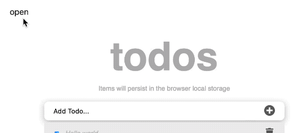
{navbarOpen ? 'close' : 'open'}
</button>
<ul>
{/* ... */}
</ul>
</nav>
In the meantime, we are rendering a button text based on the state value. We will later replace the text with proper icons.
We have also listened to a click event on the button to update the state value. On every click, the Boolean state value toggles between false and true. If we save the file, we should be able to toggle the button text on every click.
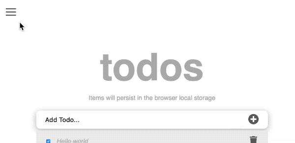
Toggle React Navigation Widget
We will use the state variable to add a class name to the widget’s element conditionally. Let’s update the ul element to include a className attribute:
<nav className="navbar">
  {/* ... */}
  <ul className={`menu-nav${navbarOpen ? ' show-menu' : ''}`}>
    {/* ... */}
  </ul>
</nav>
In addition to a menu-nav class that gets applied to the ul, we conditionally add a show-menu class only if the state value is true. If we save the file and inspect the ul in the browser DevTools, we should see the show-menu class dynamically applied when we click the toggle button.
Adding CSS to Style the Navigation Widget
Let’s add CSS to capture the toggle functionality and style the navigation widget. Open the styles/app.css file and add the following CSS rules:
/*==========================
Sidebar navigation
========================*/
.navbar {
  position: relative;
}
button {
  cursor: pointer;
  background: transparent;;
  border: none;
  font-size: 20px;
}
.navbar .toggle {
  position: fixed;
  left: 30px;
  top: 40px;
  cursor: pointer;
  background: transparent;;
  border: none;
}
.menu-nav {
  list-style: none;
  position: absolute;
  background: #fff;
  left: 0;
  width: 0;
  overflow: hidden;
  max-width: 290px;
  z-index: 9;
  font-size: 18px;
  box-shadow: 0 10px 15px -3px rgb(46 41 51 / 8%), 0 4px 6px -2px rgb(71 63 79 / 16%);
  transform: translateX(-100px);
  transition: transform ease-in-out 0.2s;
  /* transition: width ease 0.2s; */
}
.menu-nav.show-menu {
  width: 100%;
  transform: translateX(0px);
}
.menu-nav li a, .menu-nav li span {
  display: block;
  padding: 1rem;
}
.log-in {
  color: #777;
  border-top: 1px solid #efecec;
  margin-top: 15px;
  font-size: 15px;
}
/* logout */
.logout {
  position: absolute;
  right: 30px;
  top: 40px;
  display: flex;
  gap: 2rem;
  font-size: 20px;
  color: #005bb3;
}
For the toggle functionality, the focus is on the .show-menu class selector. As we can see in the CSS, we applied a width: 100%; to display the widget from width: 0; when we concealed the widget.
Let’s save and see the styles applied:
Closing Widget if We Click a Menu Link
Navigating routes using the Link or NavLink doesn’t cause a page to reload. Therefore, clicking on a menu link will render the destination route without closing the navigation widget.
To ensure it closes, we’ll add a click event to the navigation links to reset the state variable to false. Let’s update the NavLink in the Navbar component to include the onClick attribute like so:
<NavLink
  to={link.path}
  onClick={() => setNavbarOpen(false)}
>
  {link.text}
</NavLink>
Please save the file and ensure it works.
Detecting a Click Outside Navigation Widget
When we open the navigation widget, we should be able to close it when we click outside. Similar to how we did it in our dropdown menu lesson, we’ll define a logic that watches for clicks outside the widget by registering an event listener in a useEffect Hook.
In the Navbar component, let’s import useEffect Hook to hold the logic and attach a ref object from useRef Hook to the nav element:
import React, { useState, useRef, useEffect } from 'react';
// ...
const Navbar = () => {
  // ...
  const ref = useRef();
  useEffect(() => {
    const handler = (event) => {
      if (
        navbarOpen &&
        ref.current &&
        !ref.current.contains(event.target)
      ) {
        setNavbarOpen(false);
      }
    };
    document.addEventListener('mousedown', handler);
    return () => {
      // Cleanup the event listener
      document.removeEventListener('mousedown', handler);
    };
  }, [navbarOpen]);
  return (
    <>
      <nav ref={ref} className="navbar">
        {/* ... */}
      </nav>
      {/* ... */}
    </>
  );
};
export default Navbar;
If we implement it correctly and save the file, it should work as expected.
Using Icons for Toggle Buttons
We’ll get a hamburger and a close icon from the react-icons library. We have done this before, so it should be straightforward.
In the Navbar component, let’s import the following icons:
import { MdClose } from 'react-icons/md';
import { FiMenu } from 'react-icons/fi';
Then replace the text in the button element with these icons:
<button
  className="toggle"
  onClick={() => setNavbarOpen((prev) => !prev)}
>
  {navbarOpen ? (
    <MdClose style={{ width: '32px', height: '32px' }} />
  ) : (
    <FiMenu
      style={{
        width: '32px',
        height: '32px',
      }}
    />
  )}
</button>
Let’s save the file and ensure everything works as expected.
Now, we have a fully functional React application ready to be shared with the world.
Next part: Deploy React App With Vercel
continue